7 web design trends you need to know

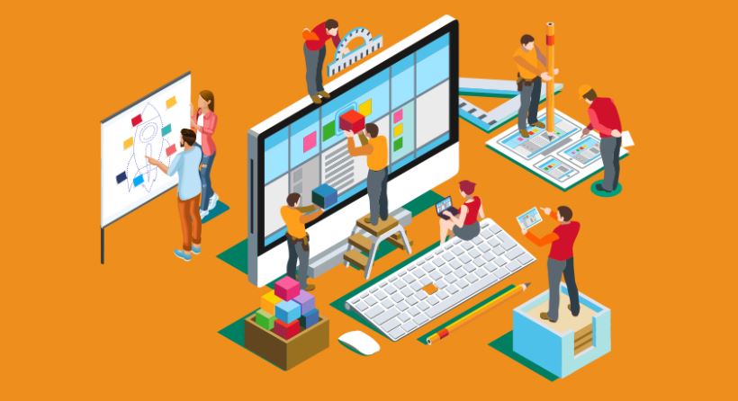
Many tech elements that gained popularity in the latter part of 2018 continue to emerge as trends in 2019. Here are seven design trends that you should know in 2019.

Colour branding

Previously, many brands and designers were stuck with web-safe colours. More designers are becoming courageous in their approach to colour, including supersaturating and vibrant shades combined with headers that are no longer just horizontal but re-imagined with slashes and hard angles. Companies are also moving towards a web design that is branded based on page or product and changes when the user navigates and interacts with the product or pages. This web design subconsciously helps the user navigate through the site and associate which product or service page they’re looking at solely based on visual colour cues.

Serifs on screen

Because of its clean readability, Sans is more favourable in various website interface. Yet, more and more brands are shifting towards bold serifs in their designs. Convention that “serifs are for print and sans serifs are for screen” is being given a shaking up. And although serifs are often associated with the past, they have lots of character and are more adaptable than you might think. The biggest contributing factor to this design trend is better screen resolutions across all devices.

Black-and-white palettes

Colour is what sets the mood when you first visit a blog. It defines a brand and creates visual landmarks in support to guide users through an interface. Absence of this colour makes textures and shapes become more obvious, making it edgier. While white represents cleanliness, purity or softness, black is powerful and assertive. Combine the two and the outcome is a striking look.

Outlined type

In a world where chunky sans serifs dominate branding, a visually lighter letterform certainly does have a different feel. Which in the end is what any new brand needs: a sense that it’s both revolutionary and trustworthy. There’s something elusive about this kind of half-there, half-gone text that immediately draws in and holds the eye, demanding that you follow the letterforms to their natural conclusion. Which makes it a pretty handy technique for memorable branding.

Mobile first

Mobile users have unquestionably surpassed desktop users in Kenya. Websites that are not mobile responsive, and adapting to various mobile devices across different platforms, will definitely lose out on a good number of clients. Icons are much more economical in terms of space and have become so common that the user has no trouble understanding them.

Chatbots evolve

Along with artificial intelligence and machine learning development, chatbots at present are more intelligent and efficient in understanding customer’s need. Your website visitors may be able to ask questions and directly get answers from the intelligent chatbots even if it’s late in the night. This can greatly help your business to operate around the clock.

Bold typography

Big and bold typography on homepages make a great impression. This works best when the rest of the page is kept minimal and clean.