Landscape colour effects

Although the initial cost of a swimming pool can be relatively high, cheaper alternatives are now available in the form of vinyl lined pools, fiberglass pools and a range of ready- made above ground pools.

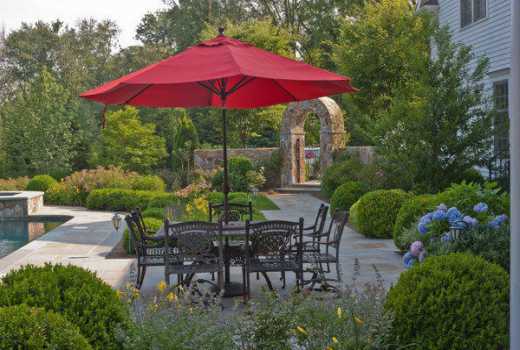
Of all the elements of landscape design, colour is perhaps the most powerful. It ets the mood and, to some extent, even determines the comfort levels and the perception of space within your outdoor rooms. 

Yet many of us don’t take this into account when choosing colours in the gardens.

A few have a list of ‘favourite colours’ which they splash all over the garden without understanding their effect on the resulting environment. The majority simply leave colour to chance.

Whether you prefer a beautiful collection of container-grown bushes for beauty, a few tomato plants for your kitchen, or your very own herb garden, the balcony often provides the space and just about the right environment to succeed.

Warm colours

Red is the hottest colour in the garden. It is energetic and powerful, often dramatic and can be exciting or even alarming. Because of its energy it is advancing and is perceived instantly, even when present in small patches among other colours. Orange is also warm and advancing. It is lively and vital, possessing some of the energetic quality of red but tempered by the yellow it contains.

Yellow is warm but without the passion of red. It is stimulating but gentle and tends to advance when combined with cooler colours. It has a clear, fresh and cheerful character.

Green lawn (with a bit of clover) in a colorful landscaped formal garden.

Cools colours

Blue is the coolest colour and the most recessive in our field of vision. It is calming and serene but also expansive and inspiring.

It embodies sophistication and elegance but can also be airy and even ethereal when used extensively.

Indigo and violet contain both blue and red.

Like blue, they are cool and receding but less so than pure blue.

The power of red gives them an uplifting quality and they can be quite mysterious.

Neutrals

Green is a neutral colour in many ways. It is neither warm nor cool, neither receding nor advancing.

It is soothing and balancing, but also stimulating. Green light is the most easily focused by the eye and so to look at green objects requires the least effort by the ocular muscles. Green also allows the sharpest distinction of contours and outlines.

White is neutral, favouring none of its composite parts; it neither advances nor recedes and is neither warm nor cool.

But because a white surface reflects all the light that falls on it, it takes on the qualities of that light.

A white flower, for instance, would appear warm and advancing in the golden or red light of sunrise and sunset, but cool and receding in blue twilight.

- The writer is a landscape architect