Decorating the fifth wall, ceiling

Golden flower sculpture on the ceiling of the marble wall at the Thai temple.

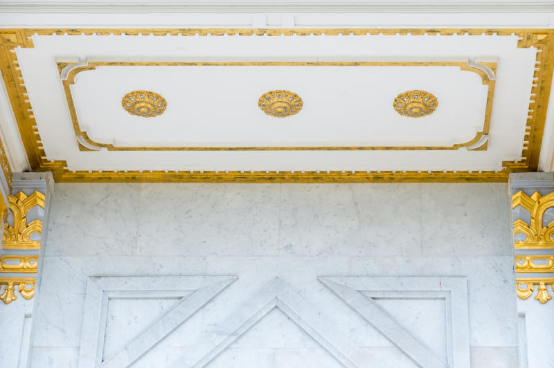
When was the last time you looked up at the ceiling? This is the fifth wall of your living space that is often ignored.  

Interior décor 2019 trends are giving a little more attention to the ceiling and decorating it with wall paper, mouldings, daring paints and, if you can handle it, mirrors.

When selecting a suitable colour for your ceiling, consider using the 60-30-10 timeless decorating rule that helps in ratios of colours selected.

Flora sculpture which decorated on the ceiling of the Thai Temple.

Your primary base colour will use 60 per cent of the room. This can be a neutral colour such as beige or magnolia, which covers large surface areas such as large walls and is what anchors the mood of the room.

A secondary colour is then selected which covers 30 per cent and uses half of the primary colour. This colour can be exhibited in the furnishings such as draperies, accent chairs, bed linens among other things.

The third colour to use is an accent colour, which takes up 10 per cent.

This can be a bold colour used in lamp shades, pillows, piece of art or a printed fabric on scatter cushions or on a throw. 

Beige walls and white ceiling in a classic style.

Not for the faint-hearted Maasai red colour can be used sparingly on a small section of the ceiling such as an entry hall or TV room. The rest of the adjacent walls should be in a neutral colour like hues of grey or sweet cream or beige.

Use the colour wheel chat to select the colours for your ceiling. An alternative is to also pull colours from a fabric where the printer and designer has already pre-selected the blending and mixing of colours.

Nature is another good source of matching colours from the colours of bird feathers or mix of colours in flowers, nature will give you a hint of which colours sit next to each other.

For those who love to break the rules of life, learn to use the rules before you break them.

You can choose to have two accent colours instead of one. Just be careful about use of proportions and balancing the densities of the colours.

Should you choose to work with monochromatic theme, you can select two shades of the same colour to provide subtle visual differentiation yet retain a relaxing ambience.  

[email protected]